Urth
Concept
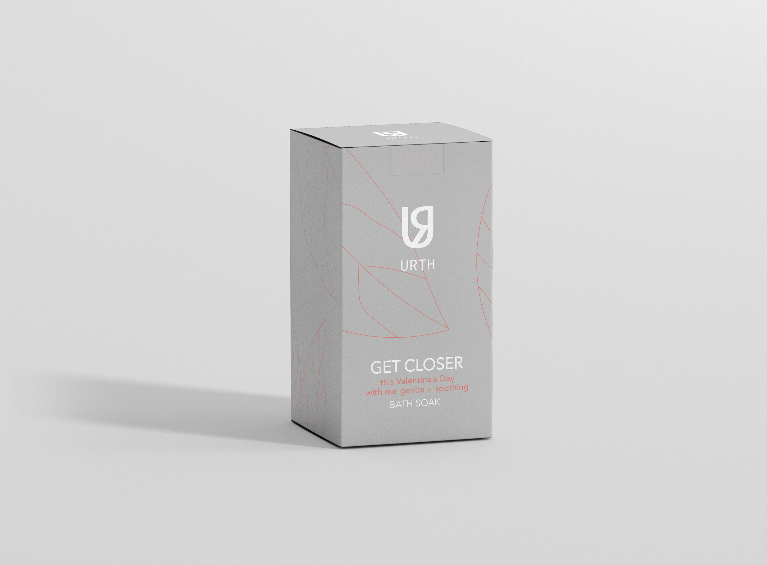
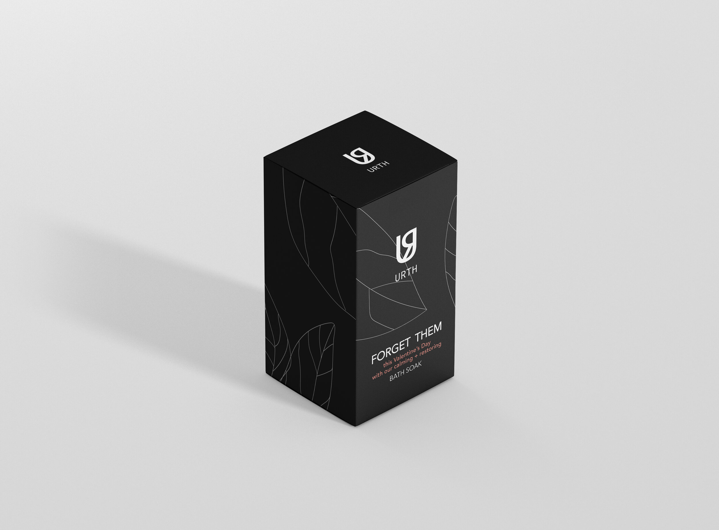
The branding for Urth Skin Studio wanted to focus on saying a lot with very little. The U and R are isolated in a way that is meant to be read as you are earth, intended to evoke a sense of community and connectivity, the rounded shapes of the icon further reinforcing these notions.


